User Interface Murks - Apple Window Stew
Designing and building user interfaces for software is hard. Really hard. And yes, even very large companies with lots of resources can get this very wrong.
Time to learn a new German word: Murks. The closest english term is "botched". In this blog, we will show you such cases, and what can be done to fix them, both from the developers point of view, as well as from the user perspective.
Episode 1 - Apple Window Stew
Here is one that really baffles me. We call it the Apple window stew.
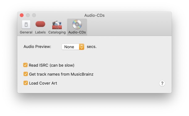
This is the NeoFinder Preferences window, as seen in all macOS versions prior to macOS 11.
As per the official Apple Interface Guidelines, the top part of a window on the Mac is the title bar with the name of the window, and controls to close, hide, or zoom that window. This is also the area that you can safely use to drag a window around on your screen, and it has been that way for more than 30 years. Users know how it works, and expect it that way.
Underneath the window title bar, you can see a toolbar, which in this case simply offers the four sections of the NeoFinder Preferences that are available.
Imagine our surprise, when we compiled and launched a new version of NeoFinder in macOS 11.
Much to our dismay, the window now looked like this:
Not only is this really ugly and confusing, it actually takes away functionality, and makes macOS harder to use!
Let us see in detail what has happened here.
Instead of having separate sections for the window title and drag area, and the toolbar underneath it, Apple has mingled and mixed these two different things together in a very unpleasant way, unlike a good stew.
What is worse, due to bugs in the spacing, we see only three of the four sections, even though the window is more than wide enough to show all of them, of course. So to use the fourth option, you must actually click on the double arrow, and select the item from the menu appearing there. What a nightmare!
Also, the toolbar icons are much smaller now, and it is much harder to see which one is currently selected. In all previous macOS versions, Apple had added a clearly visible dark background to the active item. This is now so subtle that it is hard to see, especially for visually impaired people.
For Finder windows, this is even worse. Instead of showing the entire name of a folder, which can and should be long to clarify what stuff is contained in the folder, Apple now shows only a tiny fraction of the folder name, munged up with the controls of the toolbar:
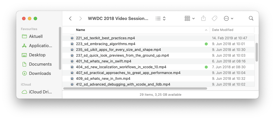
They went through great length and effort to show you a little more of the folder name when you click on it:
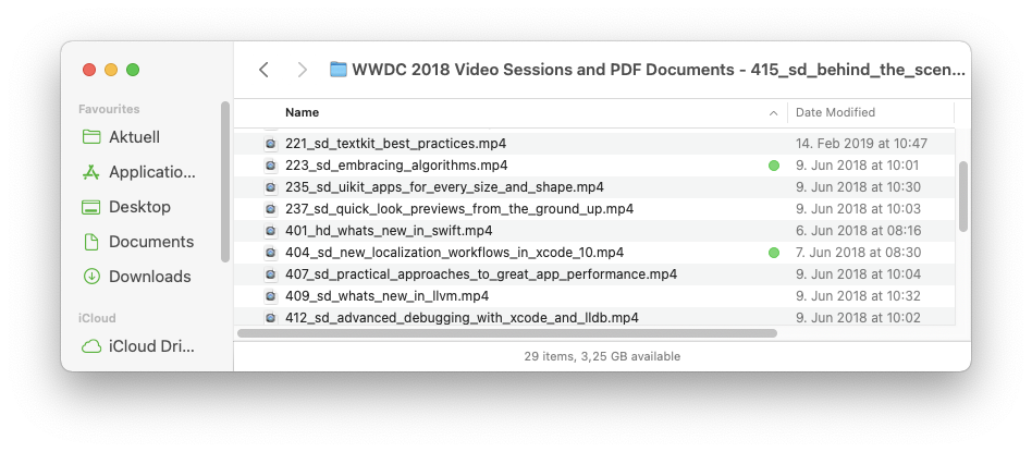
Still, it is impossible to read the entire window title, and that really makes no sense at all. There is so much space in the top section of the window, more than enough to fit a really long name.
This is really a very bad user interface design. Apple has taken a perfectly balanced and working part of macOS, and screwed it up for no particular reason.
What might be benefits of this change? Usually, when an interface is modified, there are some design goals, ideas, or plans, to make the software easier to use, or to make features easier to see and use.
In this case, it seems that Apple only wanted to change this for the sake of visual change. So it looks different from previous versions. That is all.
There is totally no benefit whatsoever from this ugly modification. On the contrary, macOS is now actually harder to use and comprehend.
There are no design ideas documented about this from Apple that would clarify the rationale behind this strange change. So we don't really know what they were thinking.
This is the worst possible reason to change a user interface. Sorry, Apple.
What can we do?
As users, please login to Apples bug reporter, innocently renamed "Feedback Assistant" a while ago, probably because Bertrand Serlet was French and really couldn't pronounce "bügrepörter" at the WWDC videos? ;-)
You find Apple bug reporter tool here: https://feedbackassistant.apple.com/
Please tell Apple what you think of this very weird new window header mashup in macOS 11. And that it is hard to use, and ugly. If enough people start complaining, Apple may actually listen for once.
If you want to keep using macOS 11, and don't want to wait until Apple fixes this, you can use the Terminal.app to paste this command line and run it:
defaults write -g NSWindowSupportsAutomaticInlineTitle -bool false
This will force macOS 11 to separate window titles and toolbars again, and make it a lot easier for you to use your Mac.
(Thanks a lot to Daniel Martín for finding this gem!)
As developers, please also leave feedback at Apples bug reporter, aka "Feedback Assistant". The more people do that, the better the chances are that Apple finds a better way of getting back to the old style.
Also, you can use a new AppKit method to bring back separate NSWindow titles and NSToolbars for your own applications in macOS 11:
if (@available(macOS 11.0, *))
{
myWindow.toolbarStyle = NSWindowToolbarStyleExpanded;
}
Please, use this method, and help your users drag their windows faster and in a better way.
Further reading
The questionable user interface choices that Apple has made in macOS 11 have caused a bunch of very interesting blog posts, and we recommend you to read them as well:
The reshaped Mac experience by Riccardo Mori
https://morrick.me/archives/9150
240 Invisible Pixels by Tyler Hall
https://tyler.io/240-invisible-pixels/
Mac OS Big Sur logbook (7) - Dialog boxes by Riccardo Mori
https://morrick.me/archives/9025
Assorted MacOS Big Sur Design-Related Observations by Nick Heer
https://pxlnv.com/blog/big-sur-design-observations/